Branding for My Social Enterprise, an Australian-based social enterprise dedicated to bridging the gap between corporations and non-profit groups.
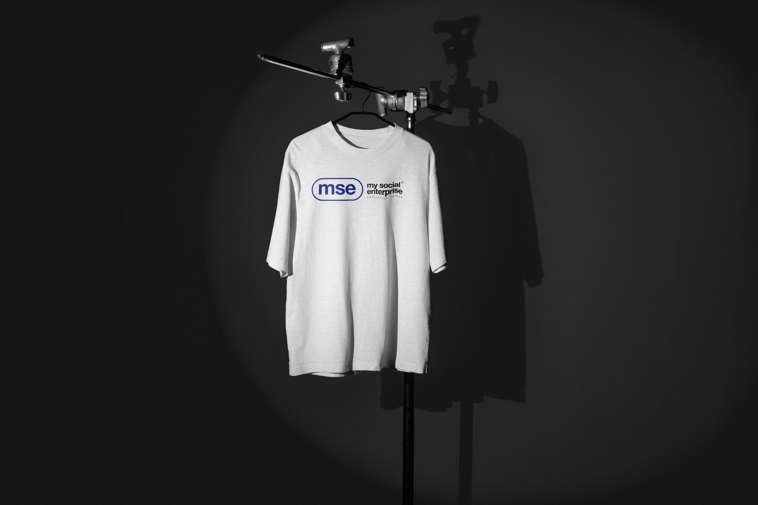
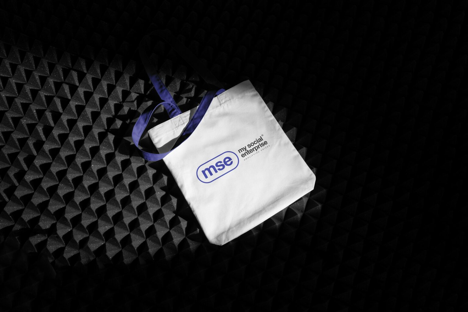
The branding for My Social Enterprise by TDS AUSTRALIA incorporates vibrant and subtle colors, reflecting an energetic approach and a serious commitment to social change.
The primary color scheme includes shades of blue, black, and white, while secondary colors are used sparingly to highlight specific elements.
This intentional use of color serves as a tool for connection, engagement, and differentiation, embodying the commitment to making a difference in a lively, energetic manner and reflecting the spirit of the causes championed by the enterprise.
𝗧𝘆𝗽𝗼𝗴𝗿𝗮𝗽𝗵𝘆 𝗮𝗻𝗱 𝗩𝗶𝘀𝘂𝗮𝗹 𝗡𝗮𝗿𝗿𝗮𝘁𝗶𝘃𝗲
Typography plays a pivotal role in the visual identity of My Social Enterprise. The primary typeface chosen is sleek and contemporary, projecting modernity and forward-thinking that aligns with the brand ethos.
Bold and assertive headings command attention and set the tone for the content, while the body text prioritizes readability and clarity. The innovative use of typography in outlined style adds a dynamic and modern layer to the visual narrative, reinforcing the brand’s commitment to contemporary design trends.
𝗖𝗼𝗻𝘀𝗶𝘀𝘁𝗲𝗻𝘁 𝗩𝗶𝘀𝘂𝗮𝗹 𝗟𝗮𝗻𝗴𝘂𝗮𝗴𝗲
By adhering to typographic guidelines and utilizing high-quality, authentic imagery mirroring the communities served, My Social Enterprise creates a consistent visual language that effectively communicates its mission and values.
The imagery, characterised by a darker palette interlaced with ample negative space, underscores the significant impact of the enterprise’s work, reinforcing its commitment to creating positive societal change.
Elevating the brand to new heights with impeccable design and strategy.
Elevating the brand to new heights with impeccable design and strategy.
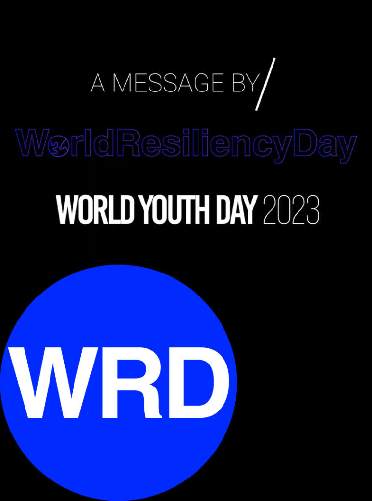
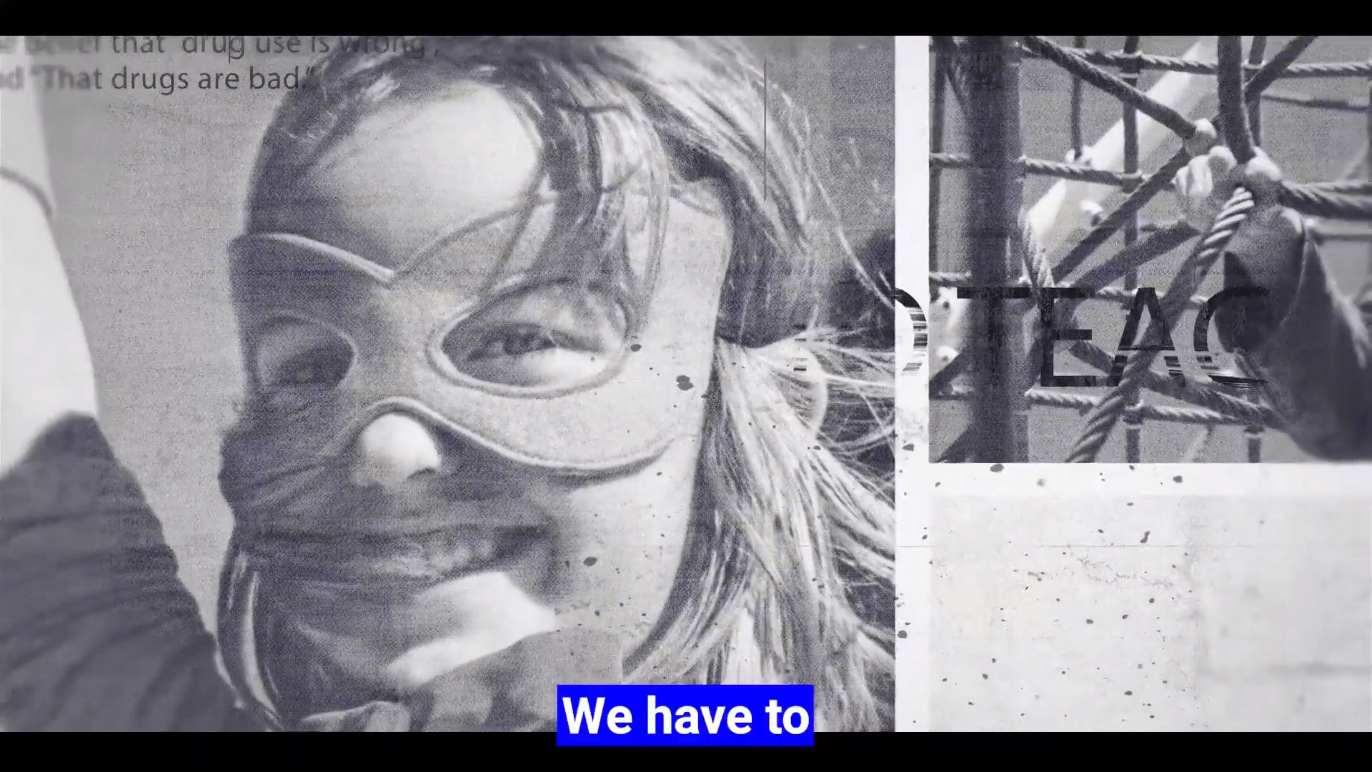
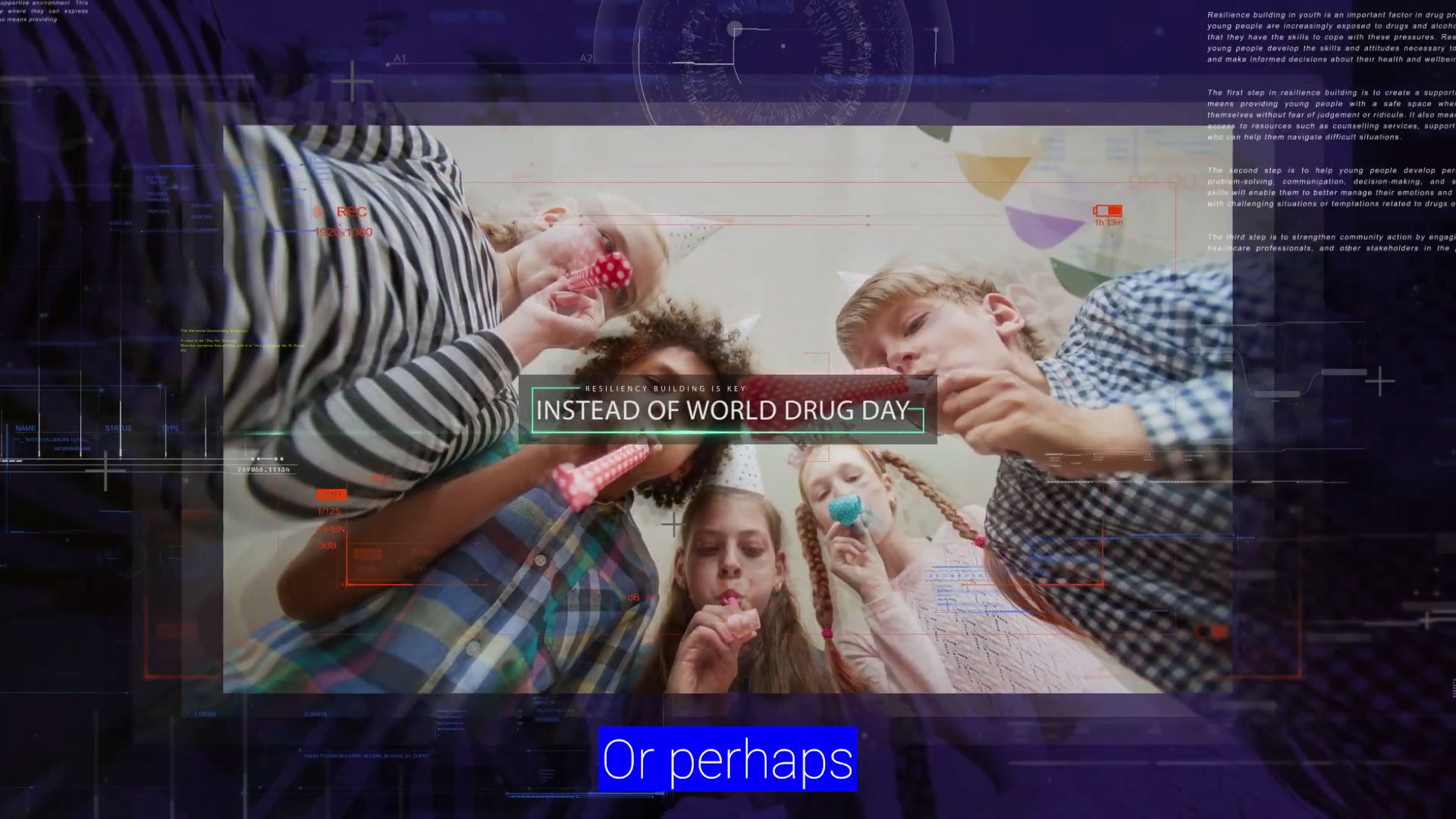
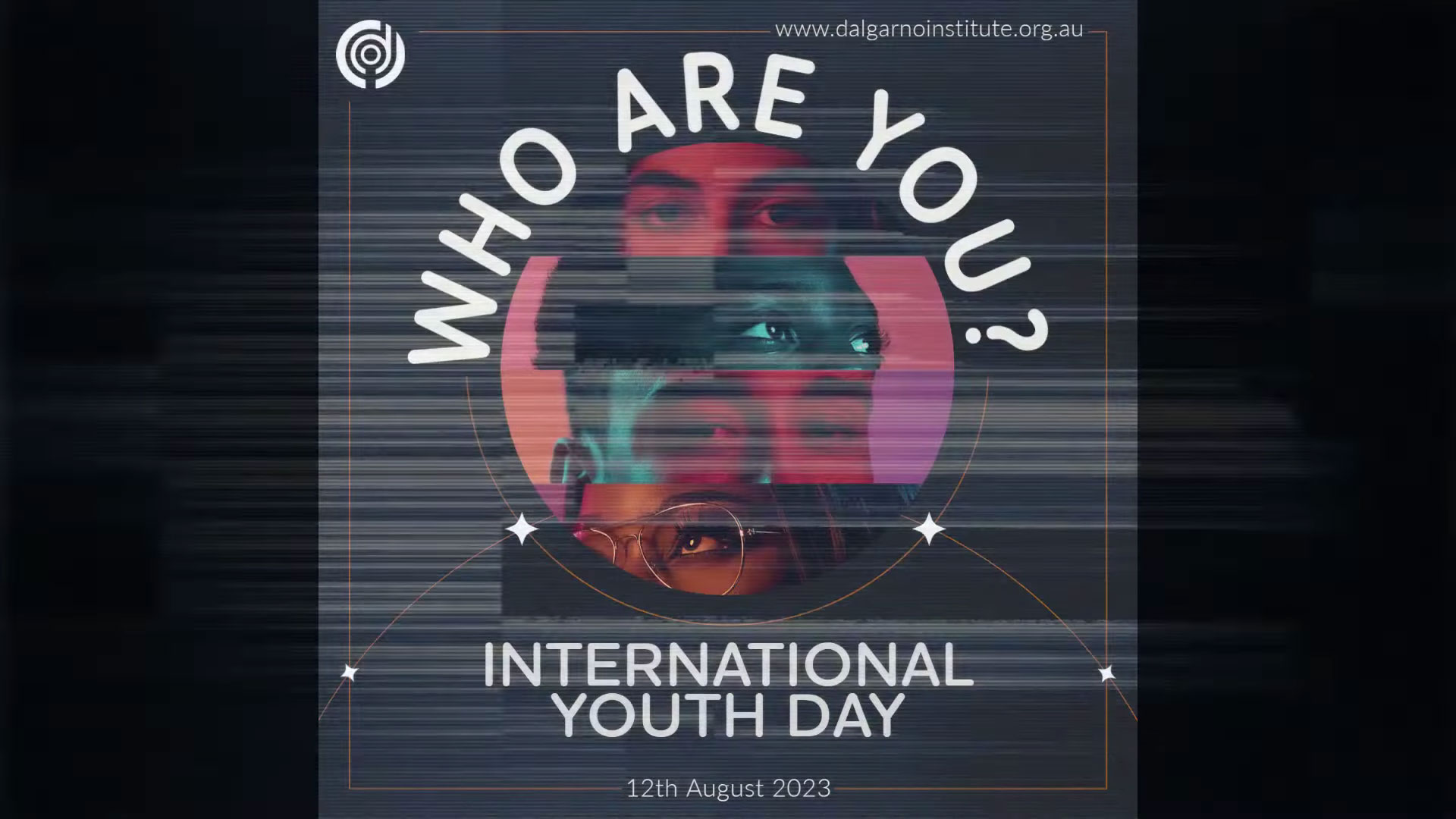
The W.A.Y Campaign Video Series: World Resiliency Day 2023 - Dalgarno Institute
TDS AUSTRALIA x DALGARNO INSITUTE
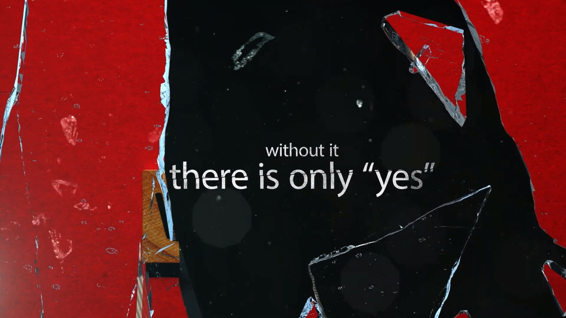
Sponsored by the Dalgarno Institute, a leading charity focused on preventing drug misuse and promoting resiliency, this campaign aimed to raise awareness about the dangers of drugs and the importance of resilience in children’s lives.
Working with charities like the Dalgarno Institute is an integral part of our work ethos, as it allows us to contribute towards meaningful, impactful change in society.


